Amber Resume Template
A one-page creative resume template with warm, inviting tones. Two-column split layout, 10 colour options, and a 6.0/10 ATS score.
Why Amber?
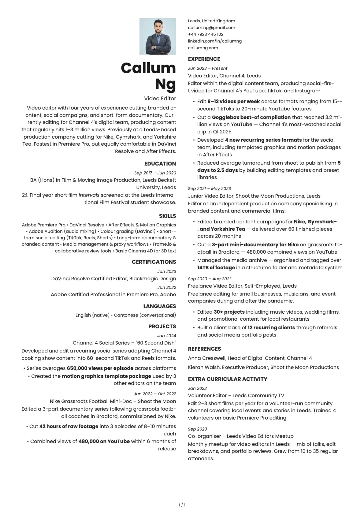
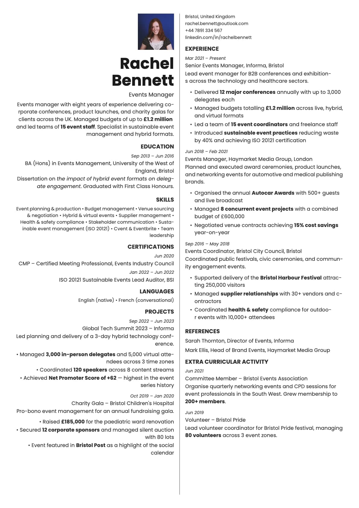
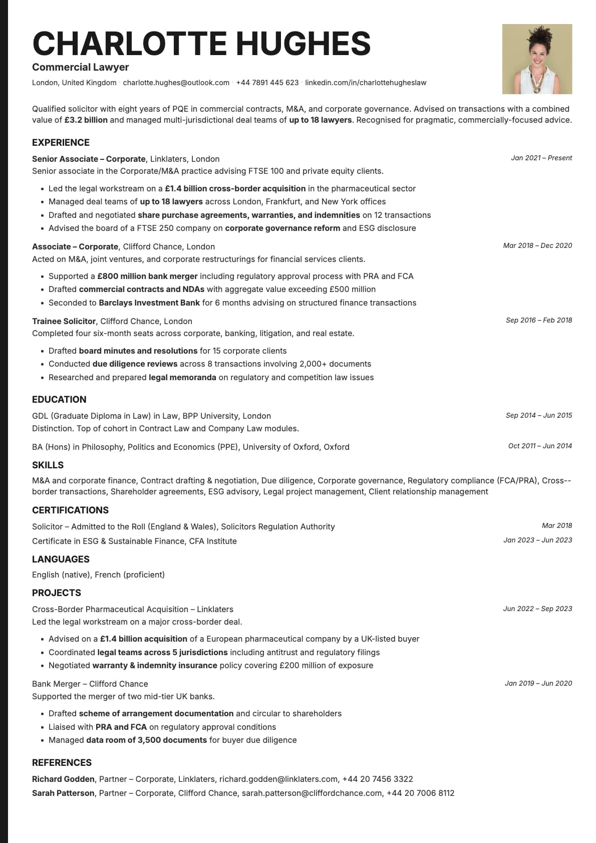
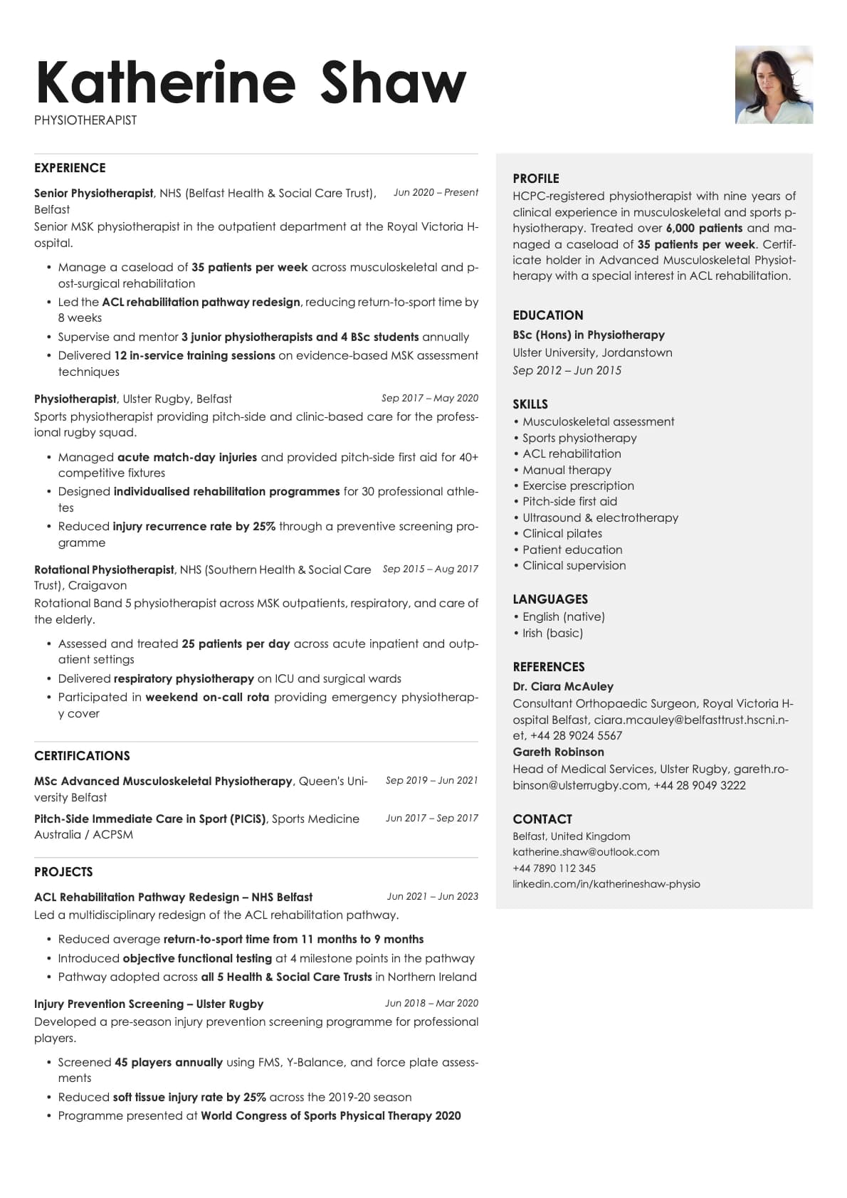
Amber is a one-page resume that makes a warm first impression. The two-column split layout keeps everything compact, and the colour palette leans into tones you would find in nature: browns, olive, dusty rose, honey, and terracotta. It feels approachable and personal in a way that most resume templates do not.
The one-page constraint is the point. Amber is not a template you grow into. It is a template that forces you to edit down to what actually matters. If you can tell your professional story in one page, this layout makes it look intentional and polished rather than incomplete.
Who should use this template?
Amber works well for creatives, freelancers, consultants, and anyone applying directly to companies where personality matters. It is a strong pick for roles at agencies, nonprofits, boutique firms, and mission-driven companies where a traditional corporate resume might feel out of place.
If you have more than 8-10 years of experience and need room for a longer career history, a one-page template will cramp you. Fern gives you a two-column creative layout with multi-page support. If you want a one-page design with a calmer, more minimalist feel, Sage strips things back further. And if you want one page with a tech-forward look and higher contrast, Obsidian is built for exactly that.
What you get
- A one-page, two-column split layout
- 10 colour themes with warm, inviting tones including bronze, olive, dusty rose, honey, terracotta, and gold
- The default font is Poppins, a geometric sans-serif that pairs well with the warm colours. You can switch to any font in Laddro (Inter, Arvo, Lora, Century Gothic, and others) in one click
- Photo support built into the layout
- Strictly one page, no multi-page overflow
ATS compatibility
Amber scores 6.0/10. Two things bring the score down: the two-column split and the one-page constraint, which can lead to tightly packed text that some parsers struggle to segment.
This is not a template you send through a faceless job portal and hope for the best. It is a template you use when a person will actually see it. Direct emails, recruiter outreach, career fair handouts, portfolio attachments. In those contexts, the ATS score is irrelevant because no machine is reading it first.
If you need to apply through ATS-heavy portals, keep a simpler single-column version on hand for those submissions and use Amber for everything else.
Colour options
You get 10 colour variations:
- Clean black and white for a classic, no-frills look
- Bronze and warm brown for an earthy, confident feel
- Olive green for a natural, grounded tone
- Dusty rose for a soft, personal touch
- Steel blue for a slightly cooler alternative
- Honey, gold, and terracotta for warmth with character
The warm tones are what give Amber its personality. Even the neutral option has a slightly warm white background that keeps it from feeling cold.
Tips for getting the most out of Amber
- Edit aggressively. One page means every word counts. Cut generic descriptions and focus on specific results. "Grew email list by 40% in 6 months" beats "Managed email marketing campaigns."
- Pick the colour that matches the energy of the role. Sending to a craft brewery? The terracotta or honey option fits. Consulting firm? Bronze or steel blue.
- Use the two-column layout to separate skills and contact info from your experience. Do not try to split your work history across both columns.
- If you add a photo, keep it professional but not stiff. Amber has a personal, human feel, so a friendly headshot works better than a corporate portrait.
Build your resume with Amber on Laddro
Start building with Amber. Fill in your details, switch colours and fonts in real time, and download a PDF when you are ready. No account needed to start.
How would you rate this template?
Your rating helps others pick the right template for their resume.