Marble Resume Template
A classic single-column resume template with soft teal and blue tones. ATS score 9.0/10. Great for corporate and professional roles.
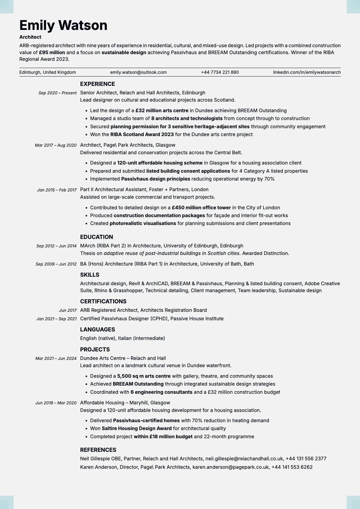
Why Marble?
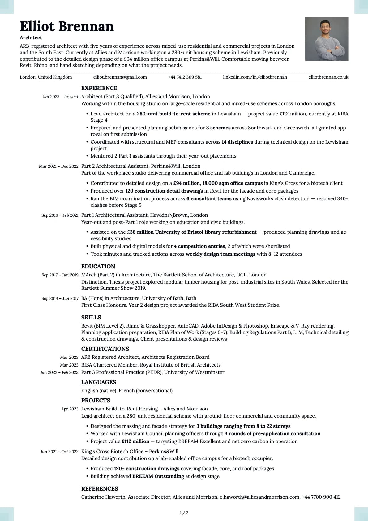
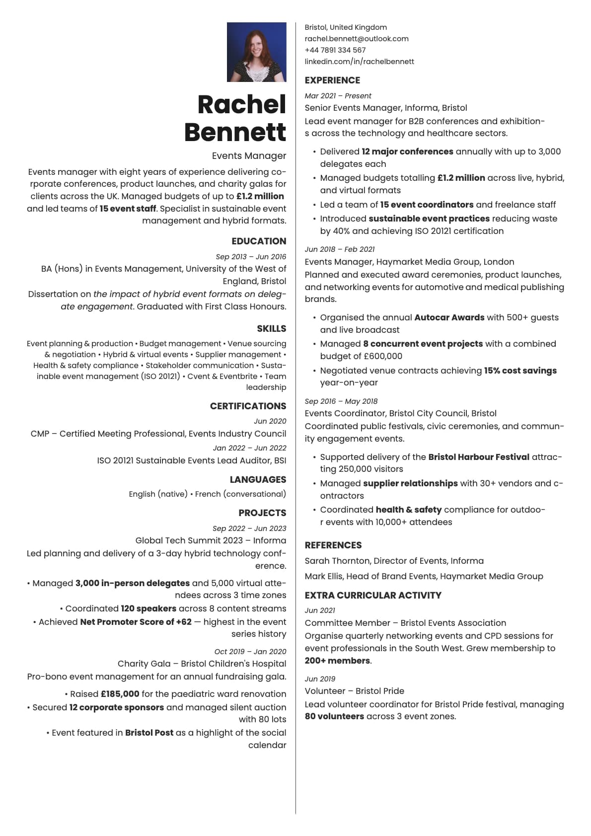
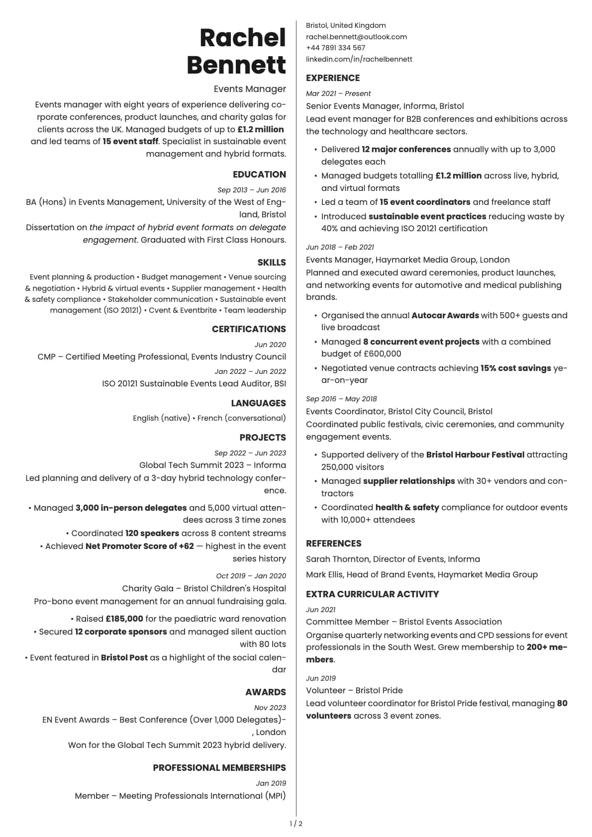
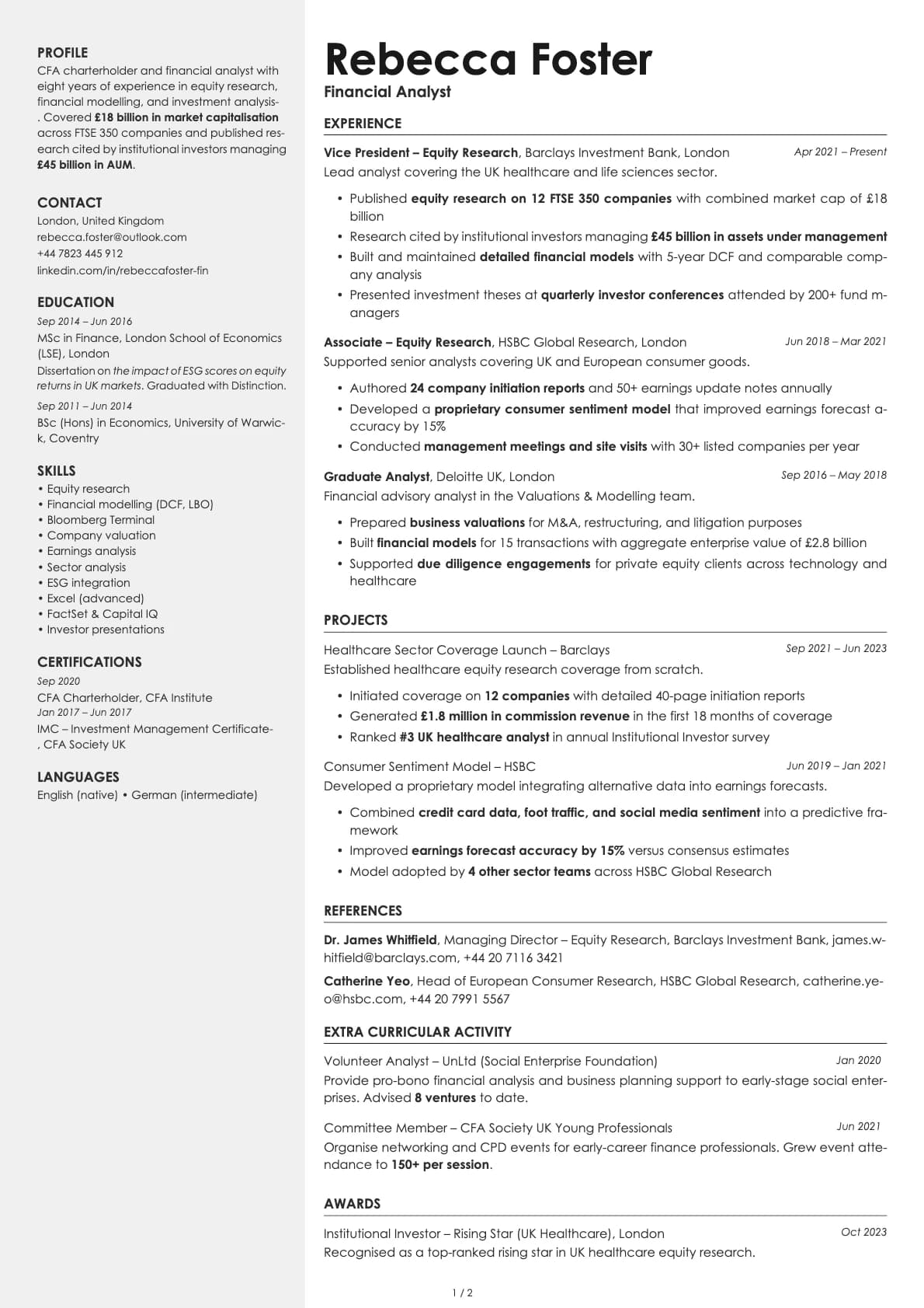
Marble is a classic single-column template that keeps things quiet and professional. It scores 9.0/10 on ATS compatibility, and the layout puts your name top-left with contact details directly below, so a recruiter knows exactly who they are looking at before they start reading.
The colour palette leans into soft, muted tones. Think teal, charcoal, slate blue, warm brown, forest green, and a muted rose. Nothing loud, nothing that draws attention away from the content. The overall effect is a resume that feels established and composed.
Who should use this template?
Marble fits corporate roles, administrative positions, project management, HR, operations, and any job where professionalism matters more than personality. It is a safe choice for industries like finance, healthcare, government, and education.
If you want something even more stripped down, Ivory gives you a warmer, more minimalist version of this same idea. For a modern minimalist look that works especially well in tech, try Limestone. And if you want something that leans more executive with dark background options, Platinum is worth a look.
What you get
- A single-column layout with a 9.0/10 ATS score
- 8 colour themes built around soft, professional tones (teal, slate, brown, green, rose)
- The default font is Inter, a versatile sans-serif. You can swap it for any font in Laddro (Arvo, Poppins, Lora, Century Gothic, and more) whenever you like
- Photo support with a dedicated photo variant
- Clean section dividers and consistent spacing that hold up across multiple pages
ATS compatibility
Marble scores 9.0/10 for ATS parsing. The structure is simple enough that every major system reads it correctly.
- Single-column flow with no tables, sidebars, or floating elements.
- All content is plain text, nothing hidden in images or graphics.
- Standard section headings that ATS software recognises out of the box.
Submit through LinkedIn, Workday, Greenhouse, Taleo, or any other platform and expect it to parse cleanly.
Colour options
The 8 options all share a common trait: restrained backgrounds with a coloured text accent that gives each version a slightly different mood.
- Near-black text on light gray for the most traditional look
- Teal and slate blue for a corporate feel with a touch of colour
- Warm brown and forest green for something that feels grounded without being boring
- Muted rose for a subtle, softer impression
Every option is designed to print well and look good on screen. You can preview each one in the builder.
Tips for getting the most out of Marble
- Let the template do the visual work. Marble already looks polished, so focus your energy on writing tight, specific bullet points instead of worrying about formatting.
- Use the teal or slate blue variant if you are in a corporate environment. Save the warmer tones (brown, green, rose) for industries that tend to be a bit less formal, like marketing, education, or nonprofits.
- Keep your sections in the standard order: summary, experience, education, skills. Marble is a classic template, and classic formatting works best with it.
- If you are applying in a region where photos are common, switch to the photo variant instead of trying to force an image into the standard layout.
Build your resume with Marble on Laddro
Start building with Marble. Fill in your details, switch colours and fonts in real time, and download a PDF when you are ready. No account needed to start.
How would you rate this template?
Your rating helps others pick the right template for their resume.