UX Designer Resume Example
A UX designer resume example with 4 years of product design experience at Monzo and Babylon Health.
Laddro Team
Overview
UX designer resumes have a paradox. You spend your career making things usable and clear. But most UX resumes are cluttered with buzzwords and say things like "created delightful user experiences" without any evidence that anyone was actually delighted.
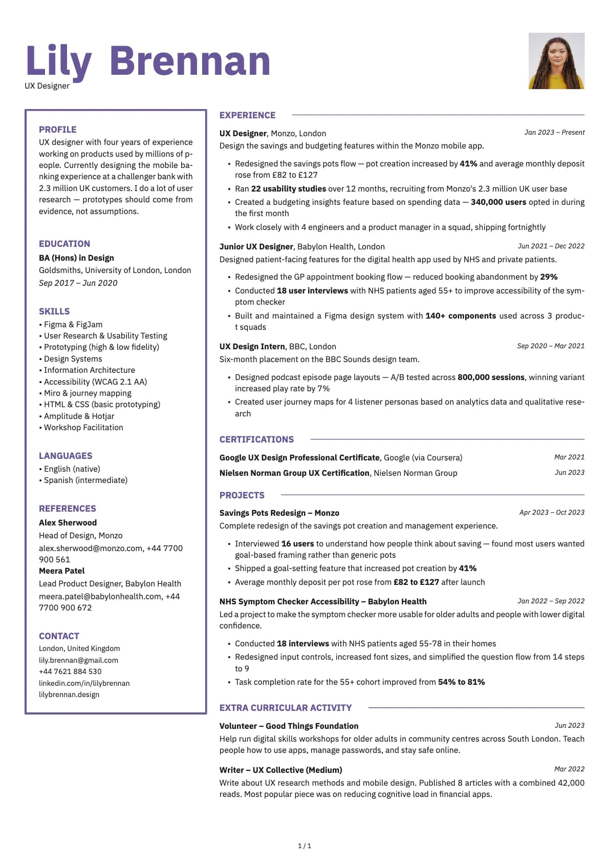
This resume belongs to Lily, a UX designer at Monzo with four years of experience. Before Monzo, she worked at Babylon Health and interned at the BBC. Her resume works because it treats design outcomes like product metrics. Pot creation up 41%. Booking abandonment down 29%. Task completion for over-55s improved from 54% to 81%. These are not design vanity metrics. They are business results tied directly to her work.
Let us go through how she does it so you can write yours the same way.
Your summary should say what you design and for how many people
Here is Lily's summary:
UX designer with four years of experience working on products used by millions of people. Currently designing the mobile banking experience at a challenger bank with 2.3 million UK customers. I do a lot of user research. Prototypes should come from evidence, not assumptions.
Short, direct, and opinionated. That last sentence about evidence over assumptions is doing something important. It tells the hiring manager how Lily thinks, not just what tools she uses.
For yours: State your experience level and the scale of the products you work on (users, customers, sessions). Name your current company and the product area. Then say something that reveals your design approach. Skip the tool list in the summary. That goes in the skills section.
How to write experience bullets that prove impact
The biggest mistake on UX resumes is describing activities instead of outcomes. "Conducted user research and created wireframes" is a process description. It does not tell the reader what happened because of that research.
Lily writes:
Redesigned the savings pots flow. Pot creation increased by 41% and average monthly deposit rose from £82 to £127
One bullet, two metrics. The recruiter now knows that her redesign had a measurable effect on user behaviour and on the business. This is the gold standard for UX resume bullets.
Another strong one from her Babylon Health role:
Redesigned the GP appointment booking flow. Reduced booking abandonment by 29%
Again, the outcome is specific and tied to a real metric. Not "improved the user experience." Improved it by 29% less abandonment.
The formula: What you redesigned + The metric that changed + By how much.
Not every piece of work has a clean percentage improvement. For those projects, describe the research that informed a decision:
Conducted 18 user interviews with NHS patients aged 55+ to improve accessibility of the symptom checker
This bullet does not have an outcome metric attached directly, but it shows the research was targeted at a specific user group for a specific reason.
Research should be quantified, not just mentioned
Lily ran 22 usability studies in 12 months at Monzo. She conducted 18 user interviews at Babylon Health. She A/B tested across 800,000 sessions at the BBC.
Each of these numbers tells the reader something different. The 22 studies show she does research regularly, not as a one-off. The 18 interviews show she works with real users, not just assumptions. The 800,000 sessions show she understands quantitative testing at scale.
If you do user research, count your sessions. Count your participants. Count the tests you ran. These numbers turn "I did some research" into "I ran 15 usability studies this quarter."
Design systems and craft: show what you built
Lily includes a bullet about building a design system:
Built and maintained a Figma design system with 140+ components used across 3 product squads
Design systems are increasingly part of a UX designer's expected output. If you have contributed to or built one, include the component count and the number of teams using it. If you created new recurring formats, templates, or pattern libraries, those count too.
At the BBC, she created user journey maps for 4 listener personas. That is a specific deliverable that shows strategic thinking beyond screen-level design.
Portfolio link: essential but often forgotten
This resume includes a personal website (lilybrennan.design). For UX designers, your portfolio is arguably more important than your resume. But the resume still needs to be strong because it is often what gets screened first, especially at larger companies with ATS filtering.
Include your portfolio URL in the header alongside your email and phone. If you have a personal site, use that. If your work is on Behance or Dribbble, those work too. The key is making sure the recruiter can click through to see your case studies without searching for them.
Skills: tools, methods, and one differentiator
Lily's skills section includes Figma, Prototyping, Design Systems, User Research, Accessibility (WCAG 2.1 AA), and Amplitude/Hotjar. Notice the mix of tools, methods, and standards.
The accessibility line is a differentiator. Many UX designers claim to care about accessibility but do not reference a specific standard. Citing WCAG 2.1 AA shows Lily knows what the actual requirements are and designs to them.
If you have experience with analytics tools (Amplitude, Mixpanel, Hotjar, FullStory), include them. These show you can measure the impact of your designs, not just create them.
Mistakes UX designers make on their resumes
No metrics. "Improved the onboarding experience" means nothing without a number. Did signups increase? Did time-to-complete decrease? Did support tickets drop? Find the metric and use it.
Tool-first thinking. Leading with "Figma, Sketch, InVision, Adobe XD" tells the recruiter you know how to use software. It does not tell them you know how to solve problems. Put tools in the skills section. Put outcomes in the experience section.
Ignoring the team context. UX design does not happen alone. Lily mentions working with 4 engineers and a product manager in a squad. This shows she can collaborate, which is often a core requirement in job descriptions.
Overly designed resume template. It is tempting to make your resume a portfolio piece. But many companies use ATS systems that cannot parse creative layouts. Use a clean template for the resume and save the design flair for your portfolio. Lily uses Opal, which has some visual character but remains readable and parseable.
One more thing
If you are applying to a product company like Monzo, your resume should read like a product person's resume. Outcomes, metrics, user numbers. If you are applying to a design agency, lean harder into the range of clients and project types. Tailor the emphasis to the type of role.
And always include your portfolio link. A UX resume without a portfolio link is like a developer resume without a GitHub. The recruiter will wonder why it is missing.
Was this resume example helpful?
Rate this example to help us create better content for you.
4.9 average from 204 ratingsRelated resume examples

Software Engineer
A software engineer resume example with practical tips on how to write your tech stack, quantify your impact, and get past ATS screening.

Frontend Developer
A frontend developer resume example with React and TypeScript experience at Skyscanner and Hargreaves Lansdown.

Backend Developer
A backend developer resume example with Go and Python experience, system throughput numbers, and infrastructure projects across e-commerce and health-tech.

Data Analyst
A data analyst resume example with experience at Lloyds Banking Group and Gymshark.

Data Scientist
A data scientist resume example with ML production experience at Scottish Power and NLP work at Luminance.

DevOps Engineer
A DevOps engineer resume example with infrastructure experience at Booking.com and AO.com.

Product Manager
A product manager resume example showing how to present user research, conversion metrics, and feature launches with real business outcomes.

QA Engineer
A QA engineer resume example with automated test suite numbers, production bug reduction, and contract testing implementation details.

Cybersecurity Analyst
A cybersecurity analyst resume example with SOC experience at Nationwide and NCC Group.

Web Developer
A web developer resume example with agency and in-house experience building Next.js sites, improving Core Web Vitals, and delivering accessible public.

Mobile Developer
A mobile developer resume example with iOS and Android experience, performance metrics, and real app user numbers.

Help Desk / IT Support Technician
A help desk technician resume example with NHS IT support experience.

IT Project Manager
An IT project manager resume example with cloud migration, programme budgets up to £8.5 million, and PRINCE2/Scrum certifications.
Related articles
AI Is Screening Your Resume Before Any Human Sees It
AI screens most resumes before a human ever reads them. 97% of companies use automated filters now. This is what that means for you and what you can do about it.

Burnout Recovery: A Real Timeline, Not 'Take a Bubble Bath'
55% of the U.S. workforce is burned out. Recovery takes 3 to 12 months. Here's what that actually looks like, stage by stage.

Career Gaps Don't Scare Recruiters Anymore. Bad Explanations Do.
84% of hiring managers look for growth stories, not perfect timelines. Career gaps aren't the problem. Leaving them unexplained is.