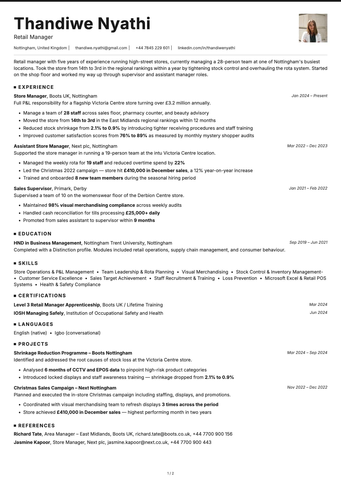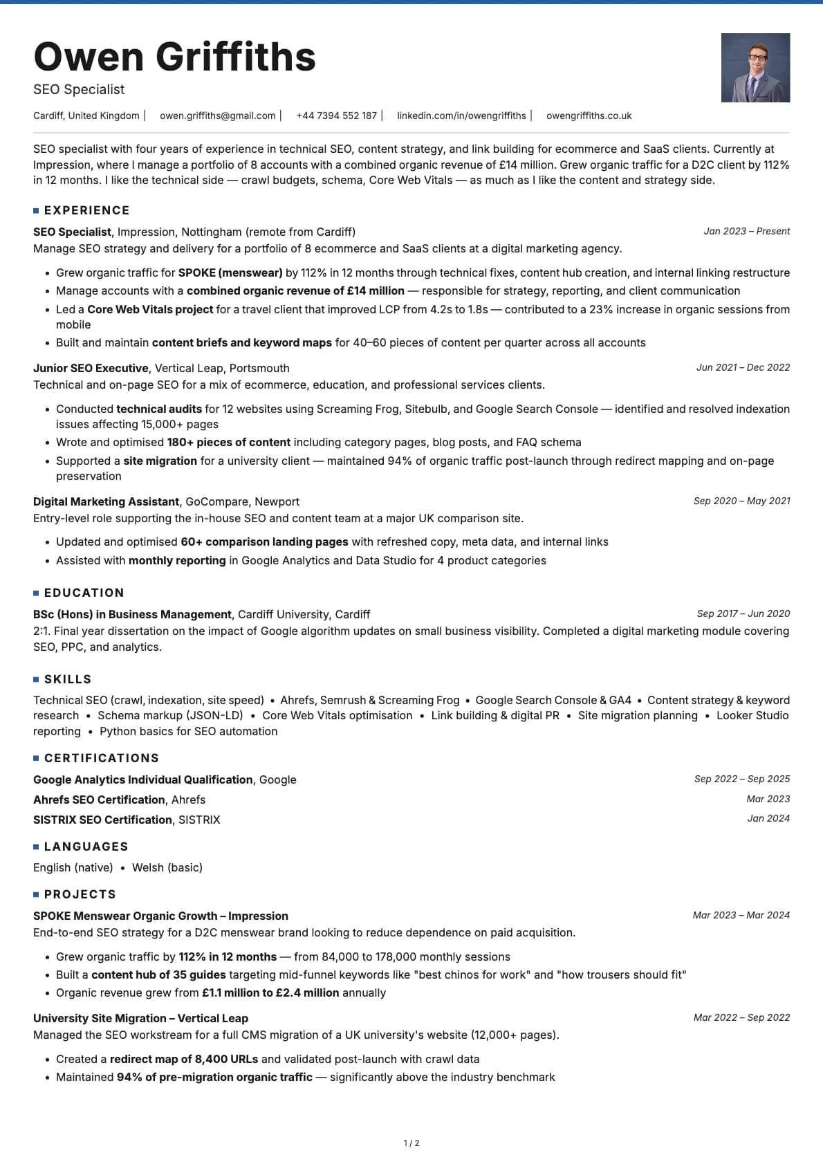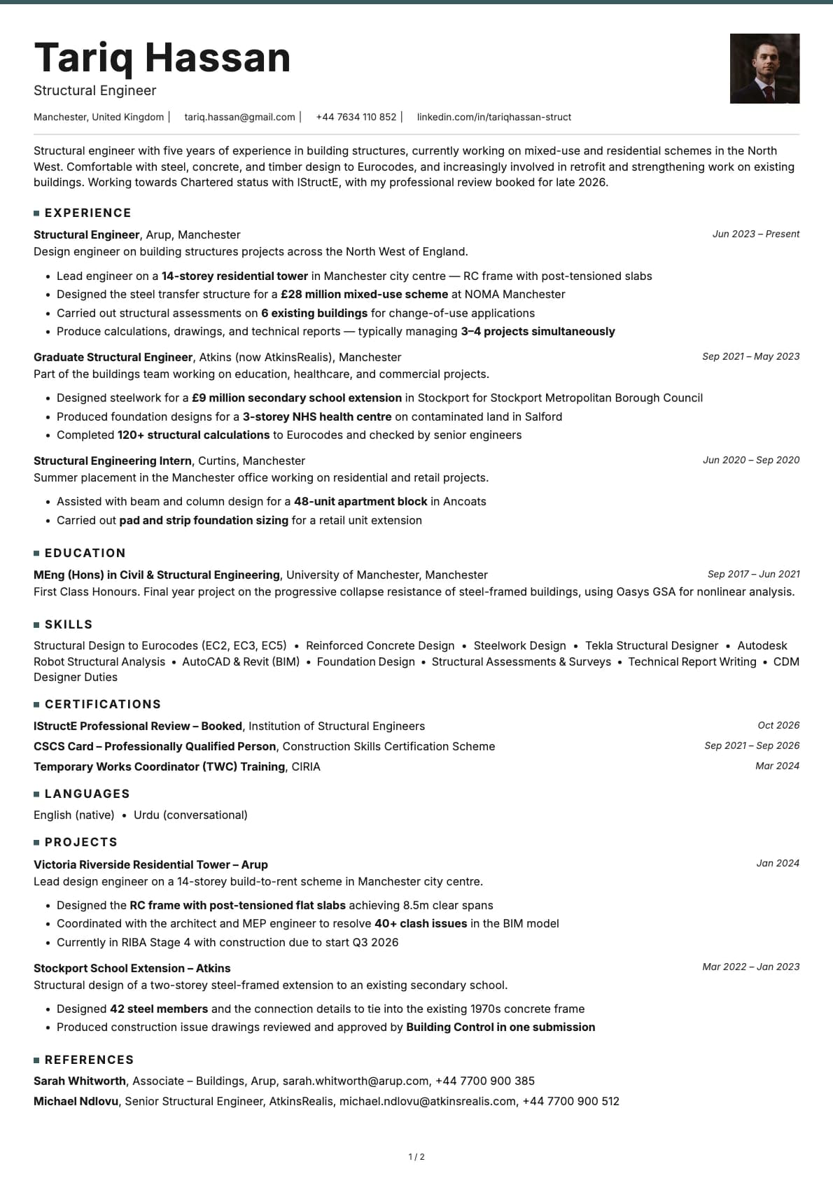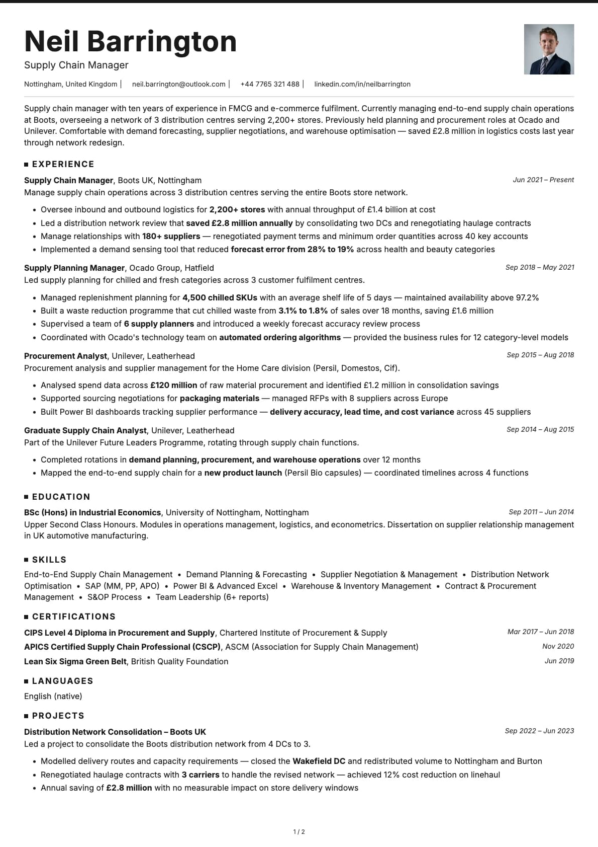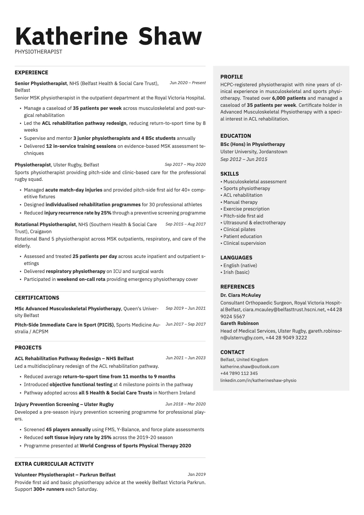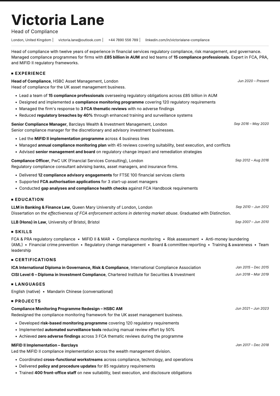
Graphite Resume Template
A clean minimalist resume template with coloured accent underlines. 7 colour options. ATS score 9.0/10. Works for tech and corporate roles.
Why Graphite?
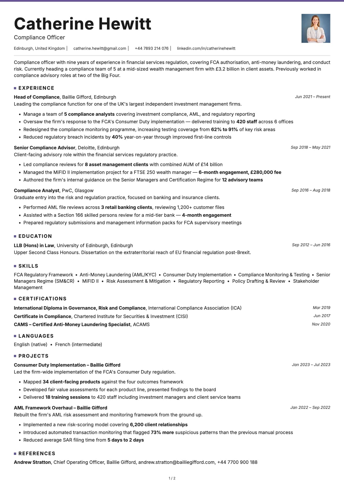
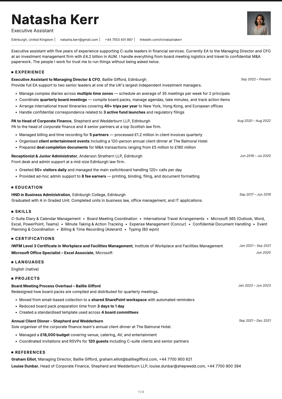
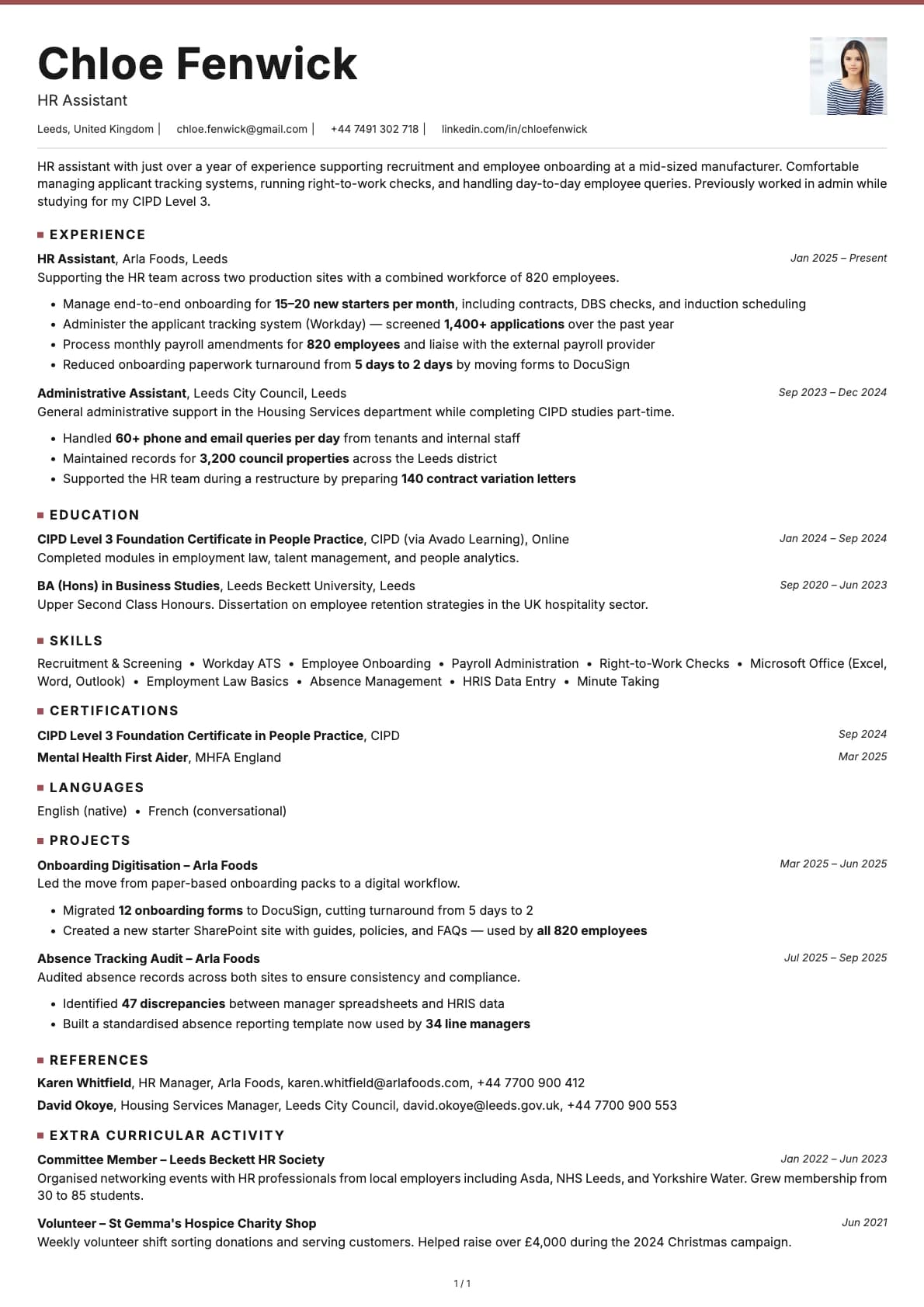
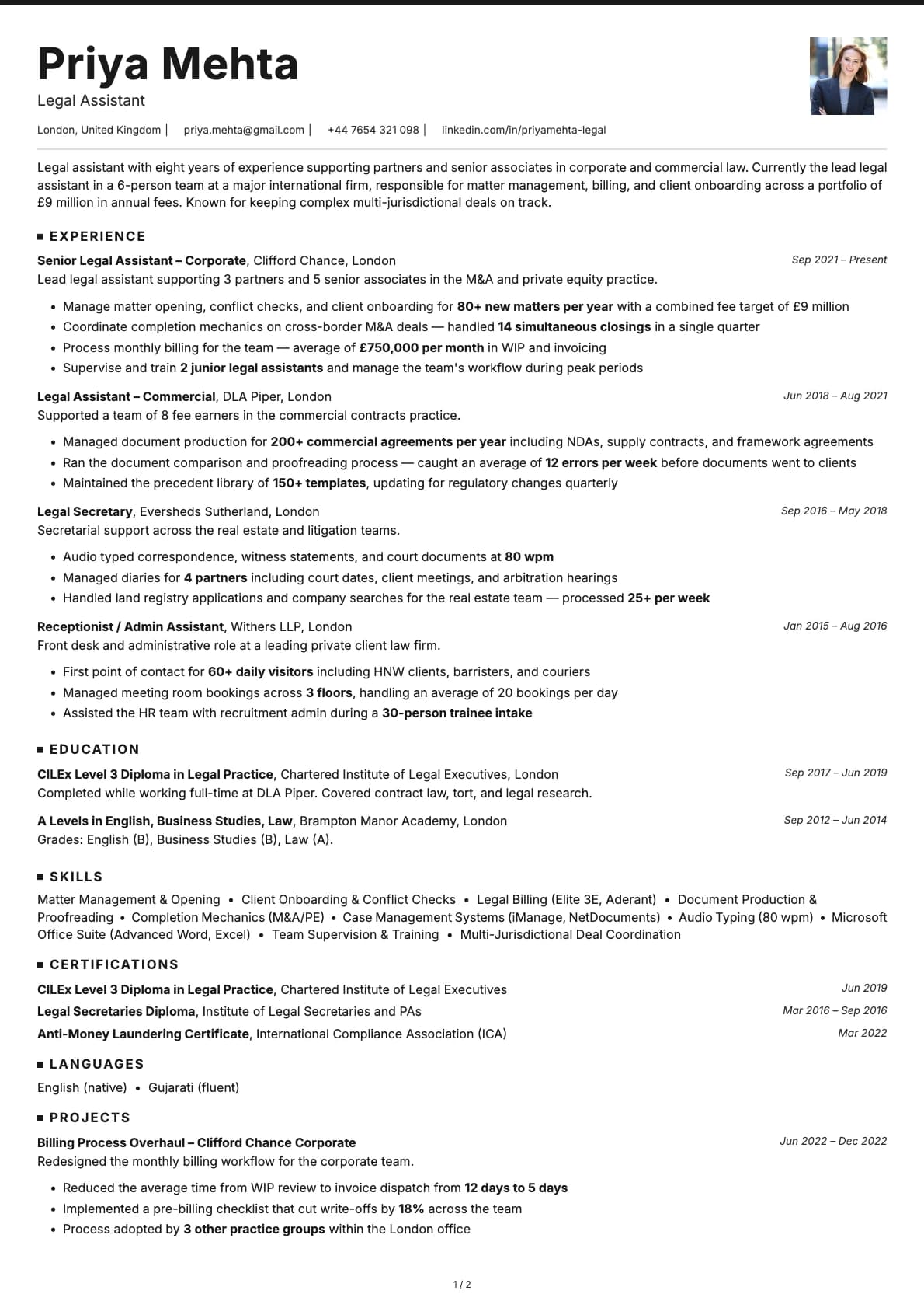
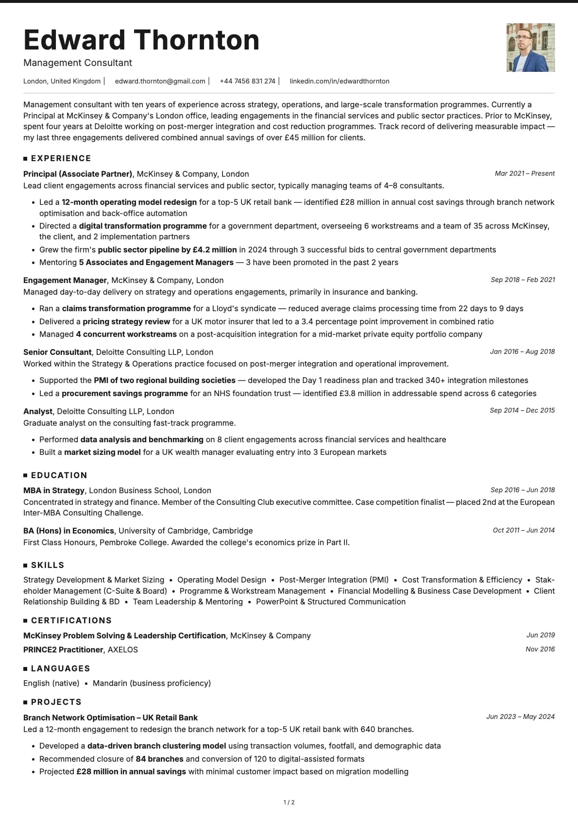
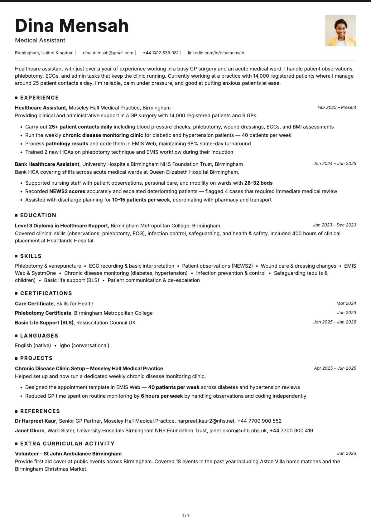
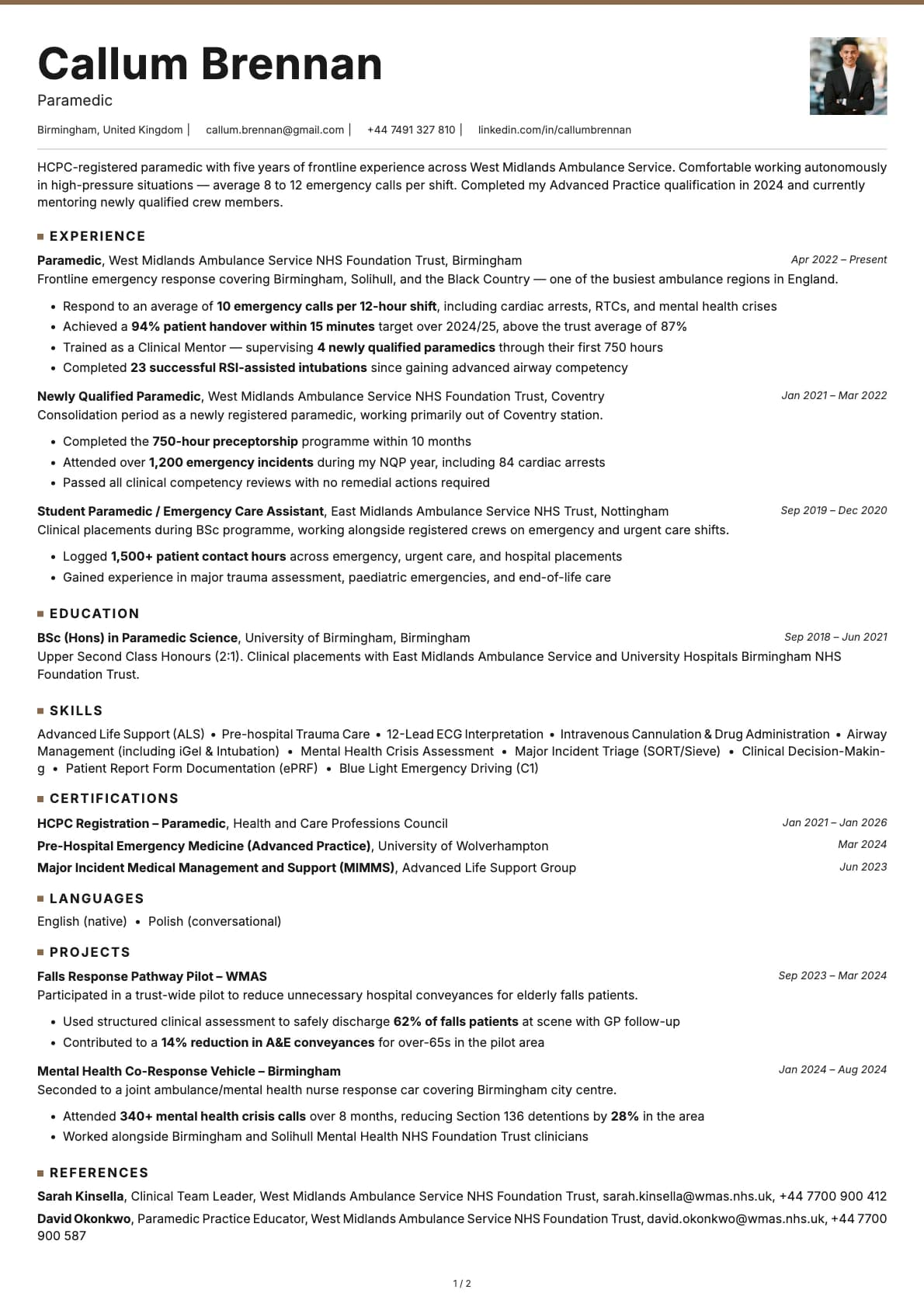
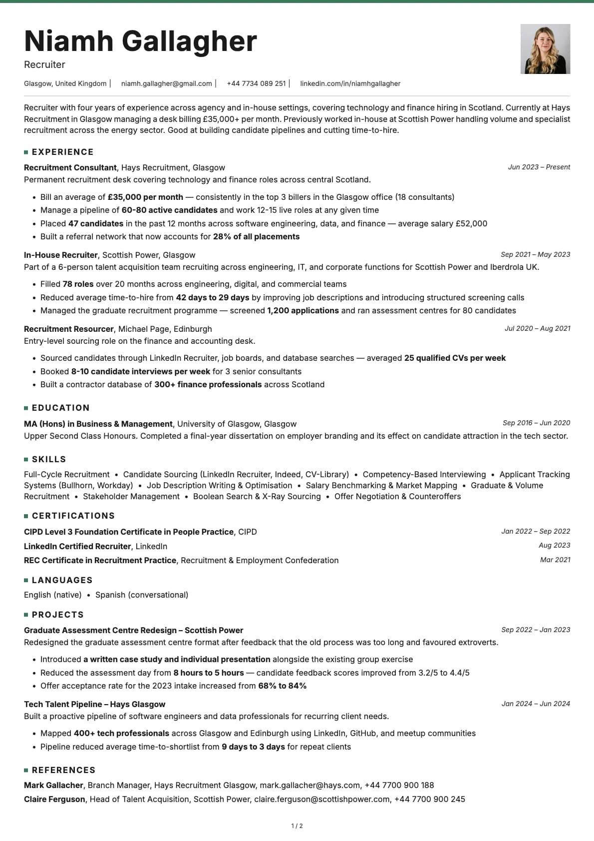
Graphite is a minimalist template that uses coloured accent underlines to separate sections. Every colour option keeps a white background and adds a single accent colour (blue, teal, brown, purple, red, or green) as a thin underline beneath headings. That small detail gives the resume just enough visual structure without adding noise.
It scores 9.0/10 on ATS compatibility. The layout is single-column, all text is native, and section headings follow standard naming. Nothing about it will trip up an automated parser.
Who should use this template?
Graphite sits right at the intersection of corporate and technical. It is professional enough for a VP of Engineering application and understated enough for a senior developer role. It works well in finance, consulting, data science, product management, and any role where you want to look sharp without looking flashy.
If you like this stripped-back style but want skills listed before experience, Limestone does exactly that with a similar minimalist feel. For tech roles where you want a more structured layout, Nickel gives you teal accents and a tech-forward look. And Copper is another strong tech option with more visual weight in its section headers.
What you get
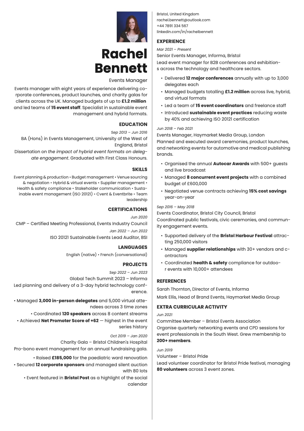
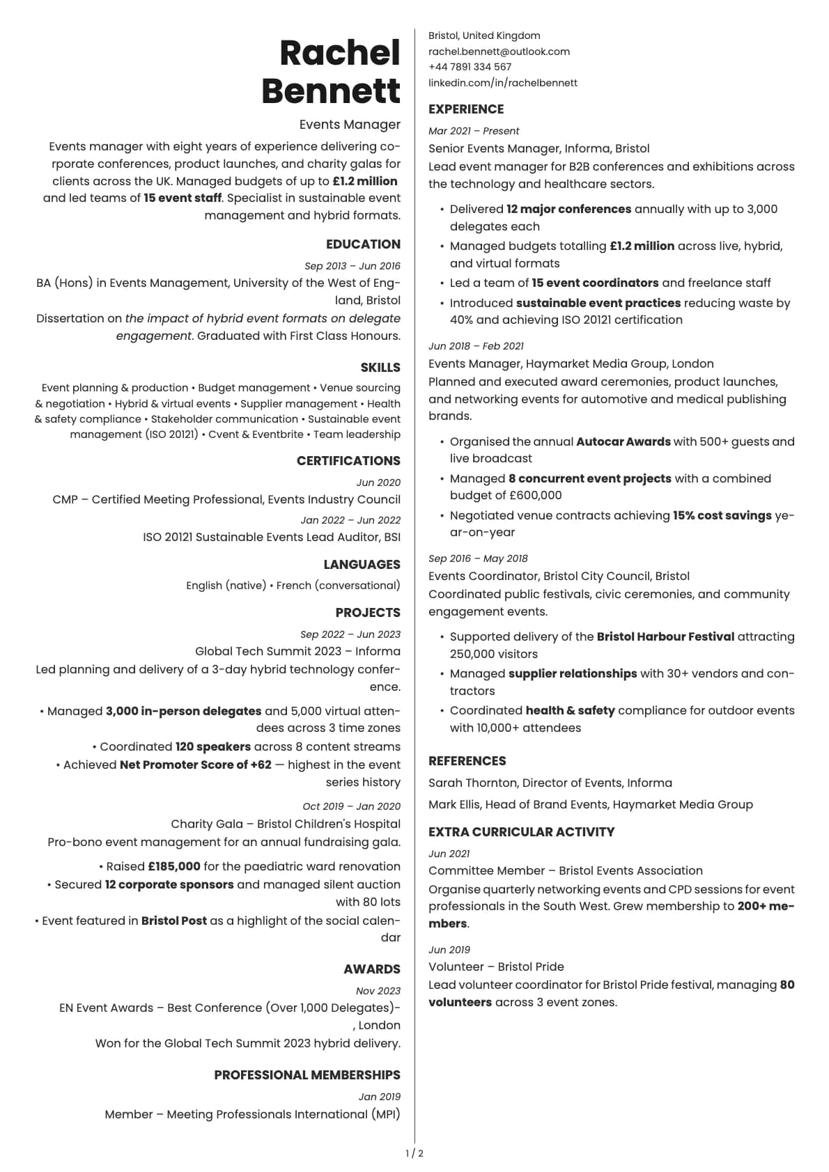
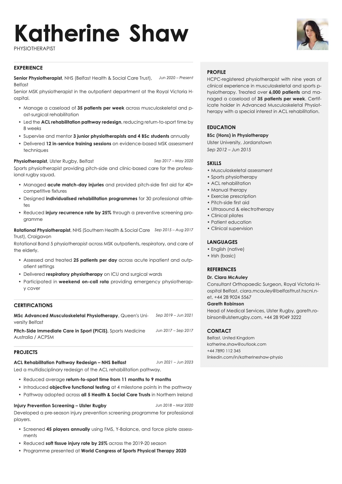
- A single-column layout with coloured accent underlines, scoring 9.0/10 on ATS
- 7 colour themes, all on white backgrounds: classic black, blue, teal, brown, purple, red, and green accents
- The default font is Avrile Sans, a refined sans-serif with a bit more character than a standard system font. You can switch to Inter, Poppins, Arvo, Lora, Century Gothic, or any other font available in Laddro
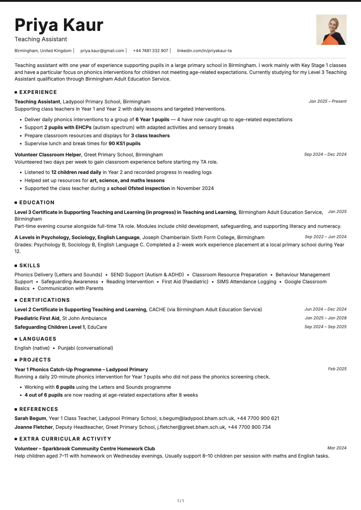
- Photo support with a photo variant
- Multi-page support for detailed resumes
ATS compatibility
Graphite scores 9.0/10 for ATS parsing. The accent underlines are decorative elements that do not interfere with how parsers read the content.
- Single-column structure with no sidebars, tables, or floating elements.
- All content is plain text. The coloured underlines are styling, not content.
- Standard section headings that every ATS system recognises.
Upload to LinkedIn, Greenhouse, Workday, Taleo, or email directly. It will parse correctly everywhere.
Colour options
All 7 options share the same white background. The difference is the accent colour used for section underlines:
- Black for the most conservative look
- Blue and teal for corporate and tech environments
- Brown for a warm, grounded feel
- Purple for something a bit different without being unprofessional
- Red for a confident, direct impression
- Green for a calmer, natural tone
The accent is subtle. It adds personality without changing the overall professional feel of the resume.
Tips for getting the most out of Graphite
- The accent underlines draw the eye to your section headings, so make sure your sections are well structured. Use clear, standard headings like "Experience," "Education," and "Skills."
- Match your accent colour to your industry. Blue and teal are safe for corporate and tech. Brown and green work well in consulting, sustainability, or education. Purple and red are fine for creative-adjacent roles like marketing or product design.
- Avrile Sans looks best at standard resume sizes. Do not shrink the font below 10pt just to fit more content. Edit the text instead.
- Use the photo variant if your industry or region expects a headshot. Otherwise, keep the standard version for maximum ATS compatibility.
Build your resume with Graphite on Laddro
Start building with Graphite. Fill in your details, switch colours and fonts in real time, and download a PDF when you are ready. No account needed to start.
How would you rate this template?
Your rating helps others pick the right template for their resume.
Resumes built with Graphite